0. Structure of this document
- The stucture is not final
- Under each object with bullets may be listed sub-objects, Description, Interaction and Graphics Design. For each of these there may be more than one bullet.
- Tags - tags are used for outlining a group that should leave feedback on specific question. This tag may be:
- [shift] for people from ShiftGlobal
- [dev] for developers
- [devid] for a specific developer
- Priorities - a tag with a digit 0-9. 9 means highest priority.
1. Aspects of the Sophie UI
1.1. Graphic look & feel (general)
I think the graphic look is generally good & we like it. The gray windows and blue details look nice.

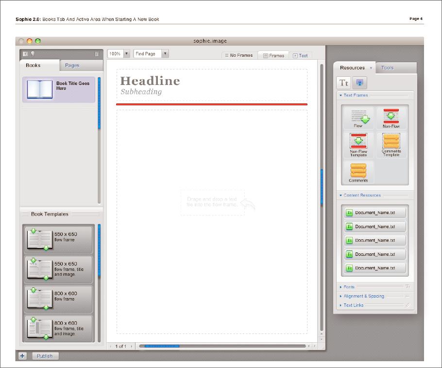
Currently, the application looks like this:

1.2. Interactions (general)
Basic questions that need to be worked out:
- Drag and drop interaction can be found here GlobalSpecification/DragNDrop. Currently it is being refactored. Groups with elements (objects) that behave the same will be introduced in order to be able to describe each element behaviour and to have consistancy.
- Number of halos on frames: ideally, there would be a balance between easily accessible functionality & less potential for confusion.
1.3. Common elements
- Flaps
- For organizing the functionalities, we will use flaps. Flaps are parts of the layout.
- Currently considered are the left and the right flap. [dev]Bottom flap is proposed for timeline editing.
- I think we're in basic agreement that things used to create books (resources, frames, etc) appear in the right flap, while things related to the structure of the book (page thumbnails, list of books) appear on the left side.
- [dev]We should hammer down exactly what the tabs are and what they are for - Sophie 1 had tabs with the vague names "tools", "library", "resources" which proved to be confusing.
- Flaps contain palettes.
- Graphics Design
- Palettes
- Palettes look like windows and are attached to tabs.
- [milo] - Detaching palettes and/or moving them to other tabs.
- Controls
- List - a lot of palettes in Sophie contain list control. List contains list items. List items are selectable and draggable.
- Grapics Design
- List items - we should have several types of them - Text, text with icon, thumbnail with text
- Interaction Design
- [dev]List items - will all of them be draggable? For example, the plugin configuration palette, list items should not be dragged to the page work area. How should we show this to the user?
- Examples of list palettes [an][dev] Obsolete?
- Page Preview palette - Shows thumbnails of the pages. List items are draggable. Do we need text (page number) in the list? The idea about showing that the page has flow frames is great, but does not cover all the cases (the frame can be chained with another frame on previous page for example). There should be one row for each page thumbnail.
- Configuration palette - Presents plugins as a list with buttons for configuration and about box. Can be with icons for each plugin. What size?
- Embedded Books Palette - shows books, that are embedded in this book.
- Opened Books Palette - shows currently opened books.
- Grapics Design
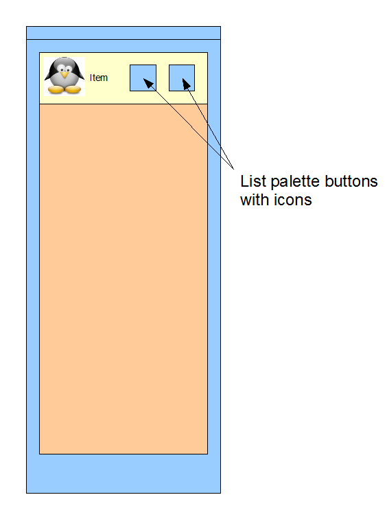
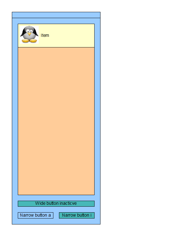
- [dev]Buttons - How will we approach buttons? We can do them inside the list (for list palettes), but it won't allow multiple selection manipulation, or we should think of good way to do it. See attached images attachment:ListPalette.png attachment:ListPalette2.png
- Meta - meta palettes will be used for displaying text and other information. Meta palettes should contain editable and non-editable fields.
- List - a lot of palettes in Sophie contain list control. List contains list items. List items are selectable and draggable.
- Graphics Design - we currently have a realization of the palettes, see attached image
- Menus
- Menus hold functionalities that cannot be triggered elsewhere, functionalities that can be accessed only by mouse (drag and drop) or keyboard shortcuts.
- Menu items can only be clicked.
- [shift]Graphics Design - we can use the operating system menu styles, but it may be inconsistant with the look and feel of the application. Windows users may feel more comfortable (not sure about Mac users). We can also use icons and text for the menu items. Currently existing menu items are listed below
- Halos and HUDs - Halos are little icons that trigger different functionality. Currently considered are two types of halos
- [dev]Clickable halos - most of the halos are clickable. The behavior that is currently accepted is that clickable halos invoke HUDs. What about delete frame halo?
- [dev]Draggable halos - halos that should be clicked on and dragged to trigger their functionality. Currently considered are Move and Rotate halos. Their functionality is overlapped with the position halo and HUD. Size is changed via dragging the frame's border. Can we say that draggable halos will be one color, green for example?

- Initial Design We like blue clickable halos, but the pictures should be somehow more clear, for appearence for example.
- Graphics Design
- We need to show somehow hint the user which halos are draggable and which are clickable.
- One thing that would be extremely useful would be easily understood icons for the halos. These were vague at best in Sophie 1; this could be improved tremendously. This is connected to the arrangement of what's in each HUD; we can't have clear icons for halos if the HUDs contain a large variety of functionality.
- Floating dialogues
- [milo]Some functionality in Sophie 2 is going to be in floating dialogue boxes - when the user presses control/command-F, for example, a window will pop up asking what you want to search for, like in other applications. This isn't how this was done in Sophie 1 (that was in the palettes); it would be useful to see how this could look.
- Tooltips
- Graphics and Interaction design - tooltips appear when mouse is over an element for fixed amount of time and disappear on mouse leave.
1.4. Specific functionalities
- Timelines
- Interaction and Graphics Design - The way timelines were done in Sophie 1 wasn't wonderful and could probably be reworked. One issue: in Sophie 1, every frame on a page had a timeline halo that was dragged to the timeline to move the frame to the timeline. (The frame itself wasn't dragged because the author presumably had positioned the frame on the page first.) This got the job done but it was confusing: most of the other halos did not behave in this way.
- Embedded books
- The way embedded books were handled in Sophie 1 - particularly the editing of embedded books - was confusing and needs to be rethought. (This has not been implemented in Sophie 2 yet.)
- [milo]Graphics Design
- Interaction Design - The main issue here is the problem of focus: you can have two books on the screen at once. In the Sophie 1 design, there was confusion because it wasn't clear what the status bar controls referred to (almost always the parent book, I think) and what the content of the palettes referred to (usually the selected book). [dev]We could probably darken the parent book when an embedded book is selected to show which one can be edited in the moment.
- Templates
- The idea of page templates is confusing to a lot of people; a way to implement this that would be quickly understandable would be fantastic. In Sophie 1, users ended up having to spend a lot of time in the page structure palette figuring out which elements on the page were part of the page template
- [dev]Explanation of templates in Sophie 2
- Reader Application
- The author application contains reading functionality; the UI of this shouldn't be too different from the authoring UI. The reader application, however, needs to have its UI thought through more carefully: many of the people using Reader won't have used Sophie previously. Because it's their first introduction, it needs to be easy to use; it should also be inviting.
(If we're planning on having Reader work in a browser as an applet, does all reader functionality need to be confined to a single window?)
1.5. UI Structure
Layout tree
- VlEngine
- AppMainWindow
- Description Application main window contains all of the layout elements and book windows. Main window has standard window controls - Minimize, Restore (Maximize) and Close buttons.
- Graphic Design

- Interaction Design Main window has standard OS controls for minimize, maximize and restore. Dialogs that are currently considered block the Application window disallowing interactions with it. Main window is drop target for Drag and drop (See InteractionAndGraphicsDesign/DragNDrop). One issue with Sophie 1 was that Mac Sophie used Mac menu bars and not the application menu bars; the Linux & Windows versions used the application menu bars. Sophie 1 was also limited to just the application window, which is not a limitation in Sophie 2.
- Description Application main window contains all of the layout elements and book windows. Main window has standard window controls - Minimize, Restore (Maximize) and Close buttons.
- LeftFlap
- Description The left flap is generally concerned with the structure of the book. In the left flap the user can find a list of open books, thumbnails of all the pages in his current book, configuration, search palette, annotations. This flap should contain non-editing palettes in order to be used in the Reader app too.
- Graphics Design Should contain tabs. Tab buttons are currently vertical, but this can be changed. Currently considered are about 6 tabs - Books, Servers, Pages, Book extras, Configuration, Search. Tabs contain palettes

- Initial Design We like the look and feel, but we need the tabs to be vertical because of the current layout and the count of tabs - they will probably be more than 6 in the left flap. We need the flap to contain only tabs, not other buttons. We like the look of the tab buttons. We need left and right flap to look alike.
- Interactions Design Can be resizeable. Height depends on main window size.
- ConfigTab
- Description [dev]This tab contains the palettes showing what plugins Sophie is using. It's worth noting that these palettes are not going to be important to most users when making books; maybe this functionality could be hidden in a floating window called from the menu bars rather than appearing in a palette?
- Graphics Design
- PluginsPalette
- Description This palette shows a list of all the plugins in the working copy of Sophie 2.
- Graphic Design This is a list palette.
- Interaction Design Selecting a plugin shows metadata about the plugin in the PluginAboutPalette.
- Description This palette shows a list of all the plugins in the working copy of Sophie 2.
- PluginAboutPalette
- Description This palette shows information about the plugin selected in the PluginsPalette .
- Graphic Design [dev] This palette displays metadata; for now, it's a paragraph of text. This plugin needs to be near the PluginsPalette to be comprehensible; these two palettes could possibly be combined?
- Interaction Design Each plugin should have an "enable" and "disable" button. Not all plugins can be enabled or disabled; some are necessary.
- Description This palette shows information about the plugin selected in the PluginsPalette .
- Description [dev]This tab contains the palettes showing what plugins Sophie is using. It's worth noting that these palettes are not going to be important to most users when making books; maybe this functionality could be hidden in a floating window called from the menu bars rather than appearing in a palette?
- BooksTab
- Description This tab contains palettes having to do with book management. Much of this functionality is duplicated by the book tab bar at the top of the application window.
- Initial Design We like general look and feel. Tab button should be vertical. The opened books list should be in a palette. Palettes should be look like each other, currently opened books list does look like a control of the tab, not like a palette. Book templates should be part of Library tab in the right flap.
- Graphics Design

- [dev]OpenBooksPalette - Shows currently opened books. The active book should be marked somehow. Do we need this?
- Description This palette lists all currently open books in Sophie. This palette does duplicate the functionality of book the Windows menu (which lists all books) and the book tab bar, which shows all open books.
- Graphic Design This is a simple list palette; it would be useful if it showed metadata for open books (preview, number of pages, size). If this were changed from a list palette to a tree palette, it could show embedded books as well & integrate the functionality of the embedded books palette.
- Interaction Design Clicking on one of the books should open the book for editing.
- Description This palette lists all currently open books in Sophie. This palette does duplicate the functionality of book the Windows menu (which lists all books) and the book tab bar, which shows all open books.
- EmbeddedBooksPalette Shows list of books that are embedded in the currently active book
- Description The embedded books palette in Sophie 1 listed all the embedded books in the currently selected book. Books were listed by name and with a preview icon.
- Graphic Design This is a list palette: essentially a list of books. Metadata would be useful: in Sophie 1, books in this palette could be either linked (where the book exists somewhere else) or fully embedded (where the book is part of the parent book's file system). This wasn't made clear, although it has ramifications for the user.
- Interaction Design In Sophie 1, the icons of embedded books could be dragged from this palette to the page of an open book to make the embedded book appear on a page; the icon of the embedded book could also be dragged from the palette to the third field of a link HUD if the action was to open an embedded book in a new window. Neither of these interactions was particularly good. We need a clear way for users to link to embedded books; we also need a good for one book to be embedded in another book. If books could be dragged from the books palette to the embedded books palette, this might solve that problem. It might make sense to treat embedded books as resources and move them into the resources palette, rather than keeping them over here.
- Description The embedded books palette in Sophie 1 listed all the embedded books in the currently selected book. Books were listed by name and with a preview icon.
- Description This tab contains palettes having to do with book management. Much of this functionality is duplicated by the book tab bar at the top of the application window.
- PagesTab
- Description - The pages tab contains palettes that have to do with pages in a Sophie books: the page preview palette and the page structure palette. The page structure palette is minimized by default to just its title bar.
- Initial Design We like the general look and feel. Tab should be vertical. Page previews should be one per row. Page preview should be in a palette - currently it looks like the list is part of the tab, not in a palette. Flow representation looks nice, but probably won't be needed because it will be confusing (flow in page 3 goes to page 1 for example). Page templates is part of Library tab at the right flap.
- PagePreviewPalette
- Description The page preview palette shows thumbnails of all the pages in the book.
- Graphic Design
 The page preview palette should show the page in thumbnail; the thumbnail should be resizable. Each page should also have a page number next to it.
- Interaction Design Clicking on a page selects that page and goes to that page in the book. In Sophie 1, page templates were dragged from the page template palette to the pages to apply page templates; if pages were multiply selected, dragging a page template to one of the selected pages will apply the page template to all selected pages. Pages could be inclusively selected by shift-clicking, or multiply selected by control-clicking. In Sophie 1, new pages were added to the book by dragging a page template between existing pages or before the first page or after the last page. This could be done in a different way.
- Description The page preview palette shows thumbnails of all the pages in the book.
- PageStructurePalette
- Description [dev]The page structure palette displays a tree of every object on the page as well as the page template being used. Controls allow moving objects from the page to the page template and vice versa, as well as saving the current page as a page template. Checkboxes allow controlling the visibility of objects on the page. Selecting an object in the page structure palette's tree selects the object on the page and vice versa.
- Graphic Design This is a variation of the list palette, the tree palette. This palette makes the hierarchy of objects comprehensible to the user; it displays the z-order of the objects and which are on the page template and which are not. There is a lot of information crammed into a small space here; this needs to elegantly represent what's on the page.
- Interaction Design Selecting an object brings up options: whether to move it to the page template or not, whether to make it invisible. This needs to be done better than it was in Sophie 1. It would be nice if objects could be dragged in the tree to change z-order; representing grouping here would also be nice.
- Description - The page structure palette shows the user a list of all the objects on his current page. When he selects something on the page it is selected in the page structure palette’s list, and vice versa.
- Graphics Design ? Since we don't have clear concept on this one, here is presented the Sophie 1 look of the page structure palette

- Description [dev]The page structure palette displays a tree of every object on the page as well as the page template being used. Controls allow moving objects from the page to the page template and vice versa, as well as saving the current page as a page template. Checkboxes allow controlling the visibility of objects on the page. Selecting an object in the page structure palette's tree selects the object on the page and vice versa.
- ToolsTab
- Description This tab contained palettes in Sophie 1 that didn't fit anywhere else - search, replace and spellcheck functionalities. There are probably better ways that things could be organized.
- Description This tab contained palettes in Sophie 1 that didn't fit anywhere else - search, replace and spellcheck functionalities. There are probably better ways that things could be organized.
- SearchPalette
- Description - The search & replace palette lets the user search for words or phrases in the text fields of his book and replace them. Enter a phrase to search for and one to replace it with; click Replace to replace the first result, or All to replace all occurrences. If there are results, they are listed below, and clicking on them will go to the page in the book where the text appears.
- Graphic Design This is a modified list palette.
- Interaction Design Clicking on the text results will go to the text results. This palette would work as a floating window called from the menu bars.
- Description - The search & replace palette lets the user search for words or phrases in the text fields of his book and replace them. Enter a phrase to search for and one to replace it with; click Replace to replace the first result, or All to replace all occurrences. If there are results, they are listed below, and clicking on them will go to the page in the book where the text appears.
- SpellcheckPalette
- Description This palette is used for spellchecking; buttons allow you to find the next misspelled word & select replacement spellings, if they exist.
- Graphic Design This palette contains several buttons and a list of spelling suggestions.
- Interaction Design Clicking the Next button moves the book to the next page with a misspelled word. This palette could be a floating window called from the menu bars.
- Description - The spellchecker palette allows to spellcheck the book from the current flow. To start it, click in a flow and press the Next button.
- Description This palette is used for spellchecking; buttons allow you to find the next misspelled word & select replacement spellings, if they exist.
- TimelinesTab
- Description The timelines tab/palette in Sophie 1 listed all the timelines in the book and had two buttons allowing the creation of single-page or multi-page timelines.
- Graphic Design This is a list palette. This probably doesn't need to be a whole tab of its own; it could go in the styles tab where the page templates are, for example.
- Interaction Design Clicking on a timeline will open it in the timeline flap. Timeline creation can probably be done from a halo.
- Description The timelines tab/palette in Sophie 1 listed all the timelines in the book and had two buttons allowing the creation of single-page or multi-page timelines.
- AnnotationsTab
- Description The annotations tab mostly is used in the Reader application, but it also appears in the Author app.
- Description The annotations tab mostly is used in the Reader application, but it also appears in the Author app.
- Graphics Design
- HighlightsPalette
- Description Highlights are a list of places that have been highlighted in the book. Clicking on one of them will go to it.
- Graphic Design This is a list palette; it's a list of the first five words in each highlight.
- Interaction Design Clicking on a highlight takes you to that page. Sophie 1 never had a good way of highlighting; text was selected, then Edit > Highlight was selected in the menu. A better way to do this (a highlighter tool) would be helpful.
- Description Highlights are a list of places that have been highlighted in the book. Clicking on one of them will go to it.
- StickiesPalette
- Description This palette lists all stickies in the current book; the new sticky button makes a new sticky.
- Graphic Design This is a list palette; it's a list of the first five words in each sticky.
- Interaction Design Clicking on a sticky goes to that page. Clicking on the new sticky button makes a new sticky.
- Description This palette lists all stickies in the current book; the new sticky button makes a new sticky.
- AudioAnnotationsPalette
- Description This palette lists all audio annotations in the current book; the new audio annotation button makes a new sticky.
- Graphic Design This is a list palette; it should show each annotation by time and page number.
- Interaction Design Clicking on an entry should go to that page. Clicking on the new audio annotation button should allow the reader to record a new audio annotation.
- Description This palette lists all audio annotations in the current book; the new audio annotation button makes a new sticky.
- AppMainWindow
- AppDocumentsDesktop
- BookDesktop - The Book Desktop is a book that uses the application window for a book window. The book desktop has only one page and doesn't support interactivity for now. The book desktop doesn't have bottom bar and preview mode. It can be used for container for resources (frames, books, etc) and acts like a regular page. It can be shown by clicking the "Show desktop" button from the Opened books tabbar or when all of the books are minimized.
- BookDocumentWindow
- Description Book Document Window is responsible for displaying a single book. This exists in Author App only. At the bottom of the window is located the book panel.
- [shift]Graphic Design

- Interaction Design Book Window has standard window controls and behavior. Scrollbars appear when they are needed. Scrolling may be done via mouse middle click.
- AuthorPageWorkArea
- SimpleSceneVisual
- FrameMoveHaloMenu
- FrameMoveButton
- SimpleSceneVisual
- ReaderPageWorkArea
- SimpleSceneVisual
- FrameMoveHaloMenu
- FrameMoveButton
- SimpleSceneVisual
- BookBottomPanel
- Description Book bottom panel is currently considered to be at the bottom of the book window. It may contain different controls depending on installed plugins. Default controls are listed below.
- Initial Design We like the initial design. The panel should be part of the book window. Find page and page selector are confusing. Generally, we prefer placing the panel at the bottom, but at the top looks good too. Test should be renamed to preview and should be a button. Actually, it should open a new window, so this may be other control.
- [shift]Graphic Design

- Interaction Design will this be detachable?
- ZoomPercentagePanel - Dropdown menu that allows typing in. Bound control - checks immidiately and if the value is correct, applys the change without confirmation. Has default values (25%, 50%, 75%, 100%*, Fit, Fit to width, Fit to height.
- NavigationPanel - Has previous and next page buttons and page number field (bound control).
- QuickSearchPanel - Text field for search in the current document. Available in both Reader and Author modes. Behavior is undefined yet.
- ReaderModeCheckBox - Probably checkbox idea will be dropped and a button will be introduced since the book is copied internally and displayed in a new window.
- ShowFramesCheckBoxPanel - Shows frames bounds on the current book. Active only in author mode.
- BookDesktop - The Book Desktop is a book that uses the application window for a book window. The book desktop has only one page and doesn't support interactivity for now. The book desktop doesn't have bottom bar and preview mode. It can be used for container for resources (frames, books, etc) and acts like a regular page. It can be shown by clicking the "Show desktop" button from the Opened books tabbar or when all of the books are minimized.


- AppMenuBar
- FileMenu
- Description The file menu is used for operations that have to do with Sophie books and the operating system.

- NewBookItem
- Description Shows New Book Window box for creating a new book.
- New Book Window
- Description This is the dialog box that's opened when a new book is created. This needs to include the option to use a book template; user should be able to set width & height of the book, title, and number of pages (if desired).
- Description Shows New Book Window box for creating a new book.
- OpenBookItem
- Description Triggers File Dialog to choose a book to open; if book is selected, book is opened.
- SaveBookItem
- Description If the book exists, saves it. Otherwise acts like "SaveBookAsItem"
- Description If the book exists, saves it. Otherwise acts like "SaveBookAsItem"
- SaveBookAsItem
- Description Toggles the file dialog to choose filename for the current active book.
- Description Toggles the file dialog to choose filename for the current active book.
- SaveBookAsTemplateItem
- Description Toggles the file dialog to choose filename to save the current active book as template. Probably the author needs to be told if saving as a template is destructive to current file; if so, they need to be prompted to save the book elsewhere first.
- Description Toggles the file dialog to choose filename to save the current active book as template. Probably the author needs to be told if saving as a template is destructive to current file; if so, they need to be prompted to save the book elsewhere first.
- ImportItem
- Description (In Sophie 1 this basically did what the Insert menu currently does, except that this would take any media type; this could also be used to import multiple resources at once, which users often wanted to do. Not sure how this will square with the Insert menu; I think Import/system drag-and-drop is better than dedicated insertions.)
- Description (In Sophie 1 this basically did what the Insert menu currently does, except that this would take any media type; this could also be used to import multiple resources at once, which users often wanted to do. Not sure how this will square with the Insert menu; I think Import/system drag-and-drop is better than dedicated insertions.)
- ExportItem
- Description (In Sophie 1 this opened a file dialogue asking for a name and location for a folder; when a name was given, that folder was filled with every resource in the currently open book.) Does it make sense to have a single "File > Export Book" option that allows the user to select PostScript, PDF, HTML rather than three separate entries? Or a submenu after Export? That could also include what we're calling ExportItem, which could become "Export Resources".
- Print
- Description If a system printer is installed, brings up the system printer dialogue to print the book. Are there going to be Sophie-specific options for this?
- Print to File
- Description Choosing this option will bring up the file dialogue to choose filename for exported PostScript. Does it make sense to have a single "File > Export Book" option that allows the user to select PostScript, PDF, HTML rather than three separate entries? Or a submenu after Export? That could also include what we're calling ExportItem, which could become "Export Resources".
- Export as PDF
- Description Choosing this option will bring up the file dialogue to choose filename for exported PDF. Does it make sense to have a single "File > Export Book" option that allows the user to select PostScript, PDF, HTML rather than three separate entries? Or a submenu after Export? That could also include what we're calling ExportItem, which could become "Export Resources".
- Export as HTML
- Description Choosing this option will bring up the file dialogue to choose filename for exported HTML. Does it make sense to have a single "File > Export Book" option that allows the user to select PostScript, PDF, HTML rather than three separate entries? Or a submenu after Export? That could also include what we're calling ExportItem, which could become "Export Resources".
- BookPropertiesItem
- Description This opens a window that shows properties (title, number of pages, size, created date) for the current book. Does this also include page size? User clicks "OK" to close. Does this actually belong in the File menu?
- CloseBookItem
- Description Closes current active book. If there are changes made, toggles the Save Changes dialog.
- Description Closes current active book. If there are changes made, toggles the Save Changes dialog.
- ExitItem
- Description Closes the Sophie 2 application window. Closes all opened books first (Save Changes dialogue box comes up if there are unsaved changes). The books may be saved as session [dev]
- Description Closes the Sophie 2 application window. Closes all opened books first (Save Changes dialogue box comes up if there are unsaved changes). The books may be saved as session [dev]
- FileMenu

- EditMenu
- Description The Edit menu is used to making changes to the content of a Sophie book: generally the items in this menu only function when something is selected in a Sophie book.

- UndoItem
- Description Undoes the last change. Active only when there are changes to undo.
- Description Undoes the last change. Active only when there are changes to undo.
- RedoItem
- Description Redoes the last change. Active only when there are changes to redo.
- Description Redoes the last change. Active only when there are changes to redo.
- CutItem
- Description Cuts the currently selected element. Active when an element that can be copied is selected.
- Description Cuts the currently selected element. Active when an element that can be copied is selected.
- CopyItem
- Description Copies the currently selected element. Active when an element that can be copied is selected.
- Description Copies the currently selected element. Active when an element that can be copied is selected.
- PasteItem
- Description Pastes an element from the clipboard. Active when an appropriate target is focused and when the clipboard is not empty.
- Description Pastes an element from the clipboard. Active when an appropriate target is focused and when the clipboard is not empty.
- DeleteItem
- Description Deletes currently selected element. Active when a deleteable element is selected.
- Description Deletes currently selected element. Active when a deleteable element is selected.
- SpellCheckItem
- Description Opens the spell check interface and starts spellchecking.
- Spell Check Interface
- Description This is the spell check interface; it should show current misspelled words, a list of possible corrections, Next, Replace, and Replace All buttons.
- Description Opens the spell check interface and starts spellchecking.
- CopyLocationOfSelectionItem
- Description From Sophie 1: copies the location of the selected text as an XML reference, which could be pasted into the link HUD to link to specific points in a text. This was a terrible interface; we need a better way to do this. The idea of marking a location in a book is probably good and can be reused (like a bookmark); this should be done in a better way.
- Description From Sophie 1: copies the location of the selected text as an XML reference, which could be pasted into the link HUD to link to specific points in a text. This was a terrible interface; we need a better way to do this. The idea of marking a location in a book is probably good and can be reused (like a bookmark); this should be done in a better way.
- GroupItems
- Description Groups currently selected items (may be groups). Active when one or more elements that can be grouped are selected.
- Description Groups currently selected items (may be groups). Active when one or more elements that can be grouped are selected.
- BreakGroup
- Description Ungroups items in currently selected group. Active only when a group is selected.
- Description Ungroups items in currently selected group. Active only when a group is selected.
- EditGroup
- Description What does this do? Saves the group in some way?
- Description What does this do? Saves the group in some way?
- Description The Edit menu is used to making changes to the content of a Sophie book: generally the items in this menu only function when something is selected in a Sophie book.

- InsertMenu
- Description The Insert menu allows users to import resources into their Sophie book based on media type.

- InsertTextItem
- Description Insert Text currently inserts an empty text frame in the Sophie book. This will probably not be the final way to do this.
- InsertImageItem
- Description Insert Image prompts the user to find an image, which is inserted on the current page and added to the resources.
- Insert Audio
- Description Insert Audio prompts the user to find an audio file, which is inserted on the current page and added to the resources.
- Insert Video
- Description Insert Video prompts the user to find a video file, which is inserted on the current page and added to the resources.
- Insert PDF
- Description Insert PDF prompts the user to find a PDF file, which is inserted on the current page and added to the resources. Currently only the first page of the PDF is inserted if it is multi-page; the import size is also set. There needs to be an interface to pick a page of the PDF and to set a size for it.
- Insert Book
- Description Insert Book prompts the user to find another saved Sophie Book, which is inserted on the current page and added to the resources as an embedded book. Presumably there will need to be import options for this.
- Description The Insert menu allows users to import resources into their Sophie book based on media type.

- View
- Description The View menu presents different ways to view the current Sophie book.
- Normal Mode
- Description Normal mode is the standard window-based interface to Sophie.
- Full Screen Mode
- Description Full screen mode makes the Sophie interface full screen, keeping the editing interface.
- Presentation Mode
- Description Presentation mode make the Sophie interface full screen without the editing interface so that books can be presented (like PowerPoint).
- ToggleRulers
- Description When this is selected, rules appear on the top and left of the book windows for the author's use.
- ShowConnectionsItem
- Description Makes chains between frames visible and editable. Could be better. [dev][an]
- Description Makes chains between frames visible and editable. Could be better. [dev][an]
- Skins
- Description The Skins menu lists every installed skin for the Sophie application; each skin gets a menu entry, and selecting an entry changes the Sophie interface to use that skin.
- SkinItem
- Description Every skin installed gets its own listing here; the default skin is called "Default Skin".
- WindowMenu
- Description The Window menu lists ways to organize open windows of Sophie books.

- CascadeItem
- Description This option cascades all open Sophie book windows. How useful is this?
- TileItem
- Description This option tiles all open Sophie book windows. How useful is this?
- DocumentItem
- Description Every open Sophie book gets a listing in this menu; selecting one of these books brings the window to the front.
- Description The Window menu lists ways to organize open windows of Sophie books.

- HelpMenu

- HelpContentsItem
- Description This brings up the Sophie help interface: a JavaHelp window.
- Help Contents window
- Description This is a window showing the Sophie documentation in outline form; it is searchable and includes hyperlinks.
- AboutItem
- Description This brings up the About Sophie window.
- About Sophie Window.
- Description This window contains information about Sophie. Clicking Okay dismisses it.
- BugReportItem
- Description Selecting this brings up the bug reporting interface.
- Bug Reporting Interface Window
- Description This window allows users to report bugs. (See here for an overview of bugtracking in pre-release Sophie.)
- HelpContentsItem

- RightFlap
- Description - The right flap contains editing tabs. These include Resources, Changes, and Library tabs. This may also contain Search tab, with Search and Replace in author and search in Reader app.
- Initial design Same as left flap - we like it generally, but it should contain more tabs, so we suggest vertical tab placement. We also need the right and the left flaps to look the same way.
- LibraryTab
- Description The library tab contains Sophie "primitives": different types of frames and book templates. "Library" is not a great name for this (also too similar to "resources"); something better should be imagined.
- Description The library tab contains Sophie "primitives": different types of frames and book templates. "Library" is not a great name for this (also too similar to "resources"); something better should be imagined.
- BookTemplatesPalette
- Description This contains a list of all the book templates that Sophie can find. Dragging one out to the workspace creates a new book using that template.
- Graphic Design List palette with preview of each book template.
- Interaction Design Dragging book template to workspace creates new book.
- Description This contains a list of all the book templates that Sophie can find. Dragging one out to the workspace creates a new book using that template.
- StylesTab
- Description This tab contains page templates and paragraph styles.
- Graphic Design This tab contains list palettes.
- Interaction Design The page template palette was the only one of these palettes that was used much in Sophie 1 - templates were dragged from this palette to the page to apply page templates or to add new pages. This was opaque to the user; a better way to apply page templates should be implemented.
- Description This tab contains page templates and paragraph styles.
- ResourcesTab
- Initial Design We like generally the design. Same concerns - the vertical tab button, the flap should be like the right flap. Palettes look very good. We need resources palette to be list. We don't need flow, non-flow, etc, but list of resources that are in the current book (like "Image.jpg") We also need resource filtering and resource preview. Text controls are not needed there.
- AllResourcesPalette
- Description This palette shows all of the resources in the current Sophie book, divided by type.
- Graphic Design This palette is a modified list palette: the list is separated by tabs of media type. We need to find a way to get a large amount of information into a very small space, as users will have a lot of resources in some books.
- Interaction Design The user should be able to drag resources from this palette onto the page of the current book. Ways for the user to organize resources will be needed.
- Description This palette shows all of the resources in the current Sophie book, divided by type.
- ResourcesMetaPalette
- Description This palette shows metadata about the selected resource in the AllResourcesPalette.
- Graphic Design This palette should should a preview of the resource as well as the filename, size, and possibly other details.
- Interaction Design This palette only displays information.
- Description This palette shows metadata about the selected resource in the AllResourcesPalette.
- BottomFlap
- Description In Sophie 1, timelines were edited in the bottom flap, which only appeared when a timeline was open. This is maybe not the best way to do this; a timeline-editing mode might be better, or a free-floating timeline window. The timeline editing area needs to be as wide as possible; it might make sense to have it as a separate window.
- Interaction Design In Sophie 1, the timeline window could only open one timeline at a time. This might be reconsidered?
- Description In Sophie 1, timelines were edited in the bottom flap, which only appeared when a timeline was open. This is maybe not the best way to do this; a timeline-editing mode might be better, or a free-floating timeline window. The timeline editing area needs to be as wide as possible; it might make sense to have it as a separate window.
- TimelineTab
- TimelinePalette
- Description The timeline palette is where timelines are edited; it contains channels and controls. More detailed discussion of timelines can be found here.
- Graphic Design The timeline interface is different from any other part of the Sophie interface; timelines are a complicated concept to explain in the context of electronic book making. The timeline interface, then, should look as much like the rest of Sophie as possible. Most of the people using the timeline interface in Sophie will not be sophisticated users of a/v editing programs; it should look simple and unimposing.
- Interaction Design The main area of concern in the timeline in Sophie 1 was the timeline slider, which proved difficult to use because it functioned both as a zoom and as a scroll bar. These two functionalities should be separated. Another problem is that of indicating when an event on the timeline is playing and when it is visible.
- Description The timeline palette is where timelines are edited; it contains channels and controls. More detailed discussion of timelines can be found here.
- TimelinePalette
Book Elements
Page
- Initial Design - we like the initial page design, but what happens when page is smaller than book window?
- Frame
- Description - frame is a name for content container. The frame has border, margin and padding. There are actually two borders - one is visible only in author mode to see what are exatly frame dimensions and location.
- Initial design Halo menu should be on top of the frame. Movement should be done in different way - we don't want a halo inside the visual area (there can be text halo menu). We suggest frame titlebar that should contain most of the halos in it and gives move opportunity. The green resize dots may be obsolete, because the resize will be done by dragging frame borders (like in Sophie 1).
- Graphics Design
- Interaction Design Frame can be resized by dragging it's edges or corners.
- TextContent
- ChainedTextContent
- Description - Chained text content is content that can be displayed in more than one frame. We should implement indicatiors for auto chained frame and chained frame. It will be most appropriate to show the user that the frame start or end is chained (or both). There should be a convinient UI to show which frames are chained, to show the connections between them.
- StaticTextContent
- Description - Static text content is content that can be displayed in one frame only. If the content cannot fit in the frame, a indicator is shown to warn the author.
- ChainedTextContent
- ImageContent
- Image content is an image that is displayed inside a frame.
- VideoContent
- Video content is a video file that is displayed inside a frame. There are controls that are visible by default, but they can be switched off. The controls are the following:
- Play - starts the video playback
- Pause - pauses the video playback
- Volume control - adjusts the volume of the current frame
- Progress bar - shows current progress of the video.
- [dev] Can we do these autohiding?
- Video content is a video file that is displayed inside a frame. There are controls that are visible by default, but they can be switched off. The controls are the following:
- AudioContent
- Audio content is an audio file that is displayed inside a frame in author mode. There are controls that are visible by default, but they can be switched off. Audio frames are not visible in preview mode and reader app. We can visualize them with an icon. The controls are the following:
- Play - starts the video playback
- Pause - pauses the video playback
- Volume control - adjusts the volume of the current frame
- Progress bar - shows current progress of the video.
- [dev] Can we do these autohiding?
- Audio content is an audio file that is displayed inside a frame in author mode. There are controls that are visible by default, but they can be switched off. Audio frames are not visible in preview mode and reader app. We can visualize them with an icon. The controls are the following:
- BrowserContent
- Flash content
- Embedded book content
- FrameGroup
- Description - Frame group contains frames or other groups. Selecting a frame group opens the same halo menu as selecting a single frame.
Halos
- PageHalo
- Description The page halo appears when the user selects the page itself. It opens the page HUD, which allows the user to set the border and fill of the page.
- [shift]Graphic Design The icon should make clear that the user is changing the border and fill of the page. This can probably be the same as the frame appearance halo.
- Interaction Design Standard halo. This halo should also appear in the top left corner of the page when a page is selected in the page preview palette; getting to this functionality can be tricky when the page is covered with frames.
- Description The page halo appears when the user selects the page itself. It opens the page HUD, which allows the user to set the border and fill of the page.
Common frame halos
- FramePropertiesHalo
- Description The frame properties halo appears when the user has selected a frame. Clicking it opens the frame properties HUD which allows the user to modify the frame's location and size and other properties.
- [shift]Graphic Design This icon should make it clear that this is going to change the basic frame properties - position & size.
- Interaction Design This is a standard halo; click on it and the HUD opens.
- Description The frame properties halo appears when the user has selected a frame. Clicking it opens the frame properties HUD which allows the user to modify the frame's location and size and other properties.
- FrameAppearanceHalo
- Description The frame appearance halo appears when the user has selected a frame. Clicking it opens the frame appearance HUD which allows the user to modify the frame's border and fill settings.
- [shift]Graphic Design This can probably be the same as the page halo. The icon should make it clear that this affects that frame's margin and fill.
- Interaction Design This is a standard halo; click on it and the HUD opens.
- Description The frame appearance halo appears when the user has selected a frame. Clicking it opens the frame appearance HUD which allows the user to modify the frame's border and fill settings.
- LinkHalo
- Description The link halo appears when the user selects the page (allowing links that happen when the page is opened) when the user selects a frame (allowing links triggered by a frame) or when the user selects text (allowing links triggered by a frame). In all cases, the link HUD is opened, which allows the author to create and modify links.
- [shift]Graphic Design Sophie 1 used a chainlink for this; something better might be nice. Possible conflict with the chaining halo.
- Interaction Design This is a standard halo; click on it and the HUD opens.
- Description The link halo appears when the user selects the page (allowing links that happen when the page is opened) when the user selects a frame (allowing links triggered by a frame) or when the user selects text (allowing links triggered by a frame). In all cases, the link HUD is opened, which allows the author to create and modify links.
- AnchorHalo
- Description The anchor halo appears when the user has selected a frame. Clicking it opens the anchoring HUD, which allows anchoring the selected frame in another flow on the current page.
- [shift]Graphic Design It seems possible that this halo could both be both dragged and clicked, which needs to be comprehensible to the author.
- Interaction Design In Sophie 1, the anchor halo was dragged to a text insertion point in another frame to anchor the frame in that flow; this was fairly opaque to most users, and it seems like it might be better to open a HUD that gives the user instructions for how to drag something that will anchor the frame. Probably we need to talk about this more.
- Description The anchor halo appears when the user has selected a frame. Clicking it opens the anchoring HUD, which allows anchoring the selected frame in another flow on the current page.
Specific content halos
- CharacterHalo
- Description Character halo is a content halo. This means it is related to specific frame content, in this case it is text. The character halo appears when the user has inserted the cursor in text or has selected text. Clicking on it opens the character HUD, which will change text settings for the selected text or from the insertion point if the user starts typing.
- [shift]Graphic Design The icon for this should make it clear that the user is changing the text settings in the selected area; mostly this is used for changing fonts, a stylized A might work.
- Interaction Design This is a standard halo; click on it and the HUD opens.
- Description Character halo is a content halo. This means it is related to specific frame content, in this case it is text. The character halo appears when the user has inserted the cursor in text or has selected text. Clicking on it opens the character HUD, which will change text settings for the selected text or from the insertion point if the user starts typing.
- ParagraphHalo
- Description A content halo. This means it is related to specific frame content, in this case it is text. The paragraph halo appears when the user's cursor is in a paragraph (in which case the changes made in the paragraph HUD will affect the paragraph of the insertion point) or when the user has selected across paragraphs (in which case the changes made in the paragraph HUD will affect all paragraphs partially or completely selected.) It brings up the paragraph HUD, which allows paragraph-level changes to text.
- [shift]Graphic Design This icon should suggest that the user is changing paragraph-level settings: a greeked paragraph might be appropriate.
- Interaction Design This is a standard halo; click on it and the HUD opens.
- Description A content halo. This means it is related to specific frame content, in this case it is text. The paragraph halo appears when the user's cursor is in a paragraph (in which case the changes made in the paragraph HUD will affect the paragraph of the insertion point) or when the user has selected across paragraphs (in which case the changes made in the paragraph HUD will affect all paragraphs partially or completely selected.) It brings up the paragraph HUD, which allows paragraph-level changes to text.
- ChainingHalo
- Description A content halo. This means it is related to specific frame content, in this case it is text. The chaining halo appears when the user selects a frame. It is used to chain frames together and to set autoflow to the next page if the frame is full.
- [shift]Graphic Design Maybe the chaining halo should be at the bottom right corner of the frame? As currently envisioned, this halo can both be dragged and clicked, which needs to be comprehensible to the author. Also the icon needs to be distinct from the link halo, which does something different.
- Interaction Design The chain halo could be dragged and dropped on another frame to chain a frame to another frame; clicking the halo could set it into autoflow mode, so the frame would automatically flow onto the next page. These interactions probably need to be worked out. Probably a table of interactions should be worked out here?
- Description A content halo. This means it is related to specific frame content, in this case it is text. The chaining halo appears when the user selects a frame. It is used to chain frames together and to set autoflow to the next page if the frame is full.
- Content control halo [dev] Is it enough to create one halo?
- Description Each content type can provide it's own halos and HUDs. This halo is considered for PDF, Flash, Browser and media frames and should trigger a HUD which gives opportunity to define whether the controls will be visible, starting page for a pdf or an embedded book, etc.
Multi frame manipulation halos
- AlignHalo
- Description The align halo appears only when the user has selected more than one frame. The align halo opens the align HUD which allows the user to align frames relative to each other.
- [shift]Graphic Design This icon chould show several frames with a frame around them.
- Interaction Design This is a standard halo; click on it and the HUD opens.
- Description The align halo appears only when the user has selected more than one frame. The align halo opens the align HUD which allows the user to align frames relative to each other.
- GroupHalo Group halo appears only when the user has selected more than one frame (group). When clicked, creates a new group.
- UngroupHalo Ungroup halo appears only when the user has selected exactly one group. When clicked, destroys the selected group.
- EnterGroupHalo Enter halo appears when a group is selected
- ExitGroupHalo Exit halo appears when the user entered a group
HUDs
[shift] We need a cool way to present more advanced features in HUDs. In Sophie 1, some HUDs opened only showing the basic features (that the user would be using 90% of the time); an icon could be clicked at the bottom of the HUD which would add a bottom section to the HUD which showed more advanced functionality. (Some HUDs had several additional sections. A better way to do this would be great.
- Initial design We like graphics design. We should decide whether a title bar is needed, but generally semi-transparent huds are great. We can move to specific HUDs now.
- PageHud
- Description The page HUD is used to set the border & fill for the page; it is just like the frame properties HUD, but acts on the page rather than a frame.
- [shift]Graphic Design The page HUD could look just like the frame appearance HUD.
- [shift]Interaction Design
- Border style
- Border size - Text field. Defines border width. Says "Custom" when advanced border is chosen
- Border style - dropdown menu with preview button (clickable box)
- None - icon in the button
- Solid color - color box
- Gradient - color box
- Image - button allows "Drop", otherwise triggers a dialog
- Pattern - button allows "Drop", otherwise triggers a dialog
- Background style - dropdown menu with preview button (clickable box)
- None - icon in the button
- Solid color - color box, on click triggers a Color Chooser
- Gradient - color box, on click triggers a Color Chooser
- Image - button allows "Drop", otherwise triggers a dialog
- Pattern - button allows "Drop", otherwise triggers a dialog
- Opacity - slider, 0-100%. Defines opacity for the whole frame.
- Mode - dropdown menu, radio buttons or checkboxes
- Custom - default style, allows editing
- Lock - locks current style, doesn't allow changing until another mode is chosen
- Template - Recovers the style defined by the template.
- Advanced page
- Advanced border
- Top - Text field. Defines top border width
- Right - Text field. Defines right border width
- Bottom - Text field. Defines bottom border width
- Left - Text field. Defines left border width
- Mode - dropdown menu, radio buttons or checkboxes
- Custom - default style, allows editing
- Lock - locks current style, doesn't allow changing until another mode is chosen
- Template - Recovers the style defined by the template.
- Advanced background - active when an image is selected
- Mode - dropdown menu, radio buttons or checkboxes
- Custom - default style, allows editing
- Lock - locks current style, doesn't allow changing until another mode is chosen
- Template - Recovers the style defined by the template.
- Image offset
- X - Text box, default is 0
- Y - Text box, default is 0
- Image Size
- Width - Text box, default is the width of the chosen image
- Height - Text box, default is the height of the chosen image
- Lock - Checkbox or button, default is ON.
- Image opacity
- Slider - 0% - 100%. Default is 0.
- Image Rotation
- Textbox, in degreees, 0-359, default is 0.
- Mode - dropdown menu, radio buttons or checkboxes
- Advanced border
- Border style
- Description The page HUD is used to set the border & fill for the page; it is just like the frame properties HUD, but acts on the page rather than a frame.
- [shift]FrameAppearanceHud
- Description The frame appearance HUD is used to set the border & fill for the frame. Color squares allow setting color; drop-down menus allow choosing different fill and border styles.
- [shift]Graphic Design Needs to be clear that clicking on a color square will invoke the color picker; the Sophie 1 colored square wasn't the best.
- [shift]Interaction Design Fairly basic HUD; this HUD does open other windows (color picker, gradient window, pattern window). Controls should be the same as the page HUD.
- Description The frame appearance HUD is used to set the border & fill for the frame. Color squares allow setting color; drop-down menus allow choosing different fill and border styles.
- FramePropertiesHud
- Description The frame properties HUD is used to set the position and size of the frame (primary uses for this HUD), as well as the margins, padding, and z-order of the frame (secondary uses for this HUD).
- [shift]Graphic Design This HUD consists of text fields and buttons.
- [shift]Interaction Design This HUD is fairly basic. Controls are the following
- Mode - dropdown menu, radio buttons or checkboxes
- Custom - default value, allows editing
- Lock - locks current size, position, margin and padding, doesn't allow changing until another mode is chosen.
- Template - Recovers the size, position, margin and padding defined by the template.
- Size
- X - spinner
- Y - spinner
- Lock - button. Locks the aspect ratio.
- Position
- X - spinner
- Y - spinner
- Orientation (rotation)
- Spinner, 0-360 degrees, default is 0
- Margin
- spinner
- Padding
- spinner
- Advanced
- Size
- Mode - dropdown menu, radio buttons or checkboxes
- Custom - default value, allows editing
- Lock - locks current size, doesn't allow changing until another mode is chosen.
- Template - Recovers the size defined by the template.
- Mode - dropdown menu, radio buttons or checkboxes
- Position
- Mode - dropdown menu, radio buttons or checkboxes
- Custom - default value, allows editing
- Lock - locks current position, doesn't allow changing until another mode is chosen.
- Template - Recovers the position defined by the template.
- Mode - dropdown menu, radio buttons or checkboxes
- Margin
- 4 spinners
- Mode - dropdown menu, radio buttons or checkboxes
- Custom - default value, allows editing
- Lock - locks current margin, doesn't allow changing until another mode is chosen.
- Template - Recovers the margin defined by the template.
- Padding
- 4 spinners
- Mode - dropdown menu, radio buttons or checkboxes
- Custom - default value, allows editing
- Lock - locks current padding, doesn't allow changing until another mode is chosen.
- Template - Recovers the padding defined by the template.
- Orientation
- Mode - dropdown menu, radio buttons or checkboxes
- Custom - default value, allows editing
- Lock - locks current orientation, doesn't allow changing until another mode is chosen.
- Template - Recovers the orientation defined by the template.
- Mode - dropdown menu, radio buttons or checkboxes
- Size
- Mode - dropdown menu, radio buttons or checkboxes
- Description The frame properties HUD is used to set the position and size of the frame (primary uses for this HUD), as well as the margins, padding, and z-order of the frame (secondary uses for this HUD).
- [shift]AlignHud
- Description The align HUD shows options for aligning selected frames relative to each other: there are buttons for aligning all selected frames horizontally (left, center, right) or vertically (top, center, bottom). This could also include controls allowing grouping and ungrouping the selected frames.
- Graphic Design This HUD shows different buttons representing different align options. Group and ungroup could be buttons as well.
- Interaction Design Would be nice to make it clear which frame the frames are being aligned with respect to.
- Description The align HUD shows options for aligning selected frames relative to each other: there are buttons for aligning all selected frames horizontally (left, center, right) or vertically (top, center, bottom). This could also include controls allowing grouping and ungrouping the selected frames.
- AnchorHud
- Description The anchor HUD is used to anchor the frame to a position in a flow in another frame on the same page. The anchor HUD allows the user to switch between unanchored and anchored modes; it also allows the user to change the anchor style, and change what the anchor is set with respect to the chosen anchor style.
- Graphic Design If the frame is anchored, the anchor HUD needs to make it clear where the frame is anchored to - a line appearing between the frame and the anchor position would be useful.
- Interaction Design Need a way to set the anchor position initally (dragging an anchor to a point in another flow?) and a way to move the anchor position once it is set. Need a way to switch between frames being anchored and frames being unanchored.
- Description The anchor HUD is used to anchor the frame to a position in a flow in another frame on the same page. The anchor HUD allows the user to switch between unanchored and anchored modes; it also allows the user to change the anchor style, and change what the anchor is set with respect to the chosen anchor style.
- CharacterHud
- Description The character HUD is used to change the text style of selected text - the font, font style, size, and color. Character styles can be saved and reused.
- Graphic Design This is a fairly basic palette: a combination of drop-down lists (all the fonts, all the font styles, saved character styles), text fields (font size), and color squares.
- Interaction Design Maybe a checkbox saying "apply to paragraph" would be useful? How character styles work with paragraph styles seemed to confuse users of Sophie 1.
- Description The character HUD is used to change the text style of selected text - the font, font style, size, and color. Character styles can be saved and reused.
- ParagraphHud
- Description The paragraph HUD is used to change the text style of selected paragraphs - alignment, leading, indents, and space above and below as well as character settings for the paragraph. Paragraph styles may be saved and reused.
- Graphic Design Graphically this is fairly basic - text fields & buttons. There is a lot of functionality in the paragraph HUD; the more important things should be at the top, less important things lower down.
- Interaction Design InDesign's use of paragraph styles is a good model for this. One tricky part of the way this worked in Sophie 1 was that users were frequently confused about how to apply character styles to paragraphs; if we had some good way to make this clear, it would be great. Maybe a button could open the character HUD for the paragraphs?
- Description The paragraph HUD is used to change the text style of selected paragraphs - alignment, leading, indents, and space above and below as well as character settings for the paragraph. Paragraph styles may be saved and reused.
- LinkHud
- Description The link HUD allows the user to create links from the page, frame, or text that is currently selected. It contains three sections: 1) a list of link triggers (double-clicking the frame, when the page appears); 2) a list of actions (turn the page, start a timeline); 3) an object of that action (a specific page to turn to, a specific timeline to play). The three link sections vary based on what is chosen in the other sections - if the action in 2 is to play a timeline, the list in 3 shows all the timelines in the book. There should also be a button allowing new sections of the link to be added or deleted (if the last section is deleted, the link settings are cleared). A drop-down menu also allows the user to save links and reuse saved links.
- Graphic Design The link HUD needs to reconfigure itself based on the choices that the user is making. Links can also be very complicated: in Sophie 1, there were books with 8 different links on the same frame, so the link HUD should fit in a fairly small space.
- Interaction Design For different kinds of links, the third section of the link is going to have to be different. If we're turning to a page, we need to have different ways to select a page; we could have a field, for example, a drop box where a page is dragged to, or a list of all the possible pages that could be chosen from. It needs to be clear to the user what they can do or what they're expected to do.
- Description The link HUD allows the user to create links from the page, frame, or text that is currently selected. It contains three sections: 1) a list of link triggers (double-clicking the frame, when the page appears); 2) a list of actions (turn the page, start a timeline); 3) an object of that action (a specific page to turn to, a specific timeline to play). The three link sections vary based on what is chosen in the other sections - if the action in 2 is to play a timeline, the list in 3 shows all the timelines in the book. There should also be a button allowing new sections of the link to be added or deleted (if the last section is deleted, the link settings are cleared). A drop-down menu also allows the user to save links and reuse saved links.
Keyboard Shortcuts
- Description Most keyboard shortcuts should repeat an action in the menu bars; users can learn the keyboard shortcuts by looking in the menu bars.
- Current Keyboard Shortcuts
- control-b, File > Book Properties, shows book properties.
- control-n, File > New Book, creates a new Sophie book.
- control-o, File > Open Book, opens a Sophie book.
- control-q, File > Quit Sophie 2, quits Sophie.
- control-s, File > Save, saves the current Sophie book.
- control-shift-s, File > Save As, saves the current Sophie book with a new name.
- control-y, Edit > Redo, redoes the last undone action, if there is one.
- control-z, Edit > Undo, undoes the last action.
- F1, Help > Help Contents, shows help.
- F5, View > Presentation Mode, goes into presentation mode.
- F11, View > Fullscreen Mode, goes into full screen mode.
- Current Keyboard Shortcuts, will probably be deprecated
- control-i, Help > Inspector, shows the inspector (a developer tool).
- Planned Keyboard Shortcuts
2. Schedule
(This part of the doc lists when things should happens, milestones etc.)
2.1. Major Dates
2009-08-14: This is the first Beta release; most of the UI should be integrated into the product at this point so it can be critiqued.
2.2. Minor Dates
2009-05-13: When the first round of this document will be critiqued by Shift.
3. Comments
Attachments
-
sophie2.jpg
(74.8 KB) -
added by deyan 16 years ago.
Initial suggestion from ShiftGlobal
- ListPalette.png (21.7 KB) - added by deyan 16 years ago.
- ListPalette2.png (21.2 KB) - added by deyan 16 years ago.
- imageframe.jpg (10.1 KB) - added by deyan 16 years ago.
- currentinterface.jpg (127.9 KB) - added by deyan 16 years ago.
- priorities.txt (1.6 KB) - added by deyan 16 years ago.